
Let me be honest with you.
Most landing pages don’t fail because of bad design or tools. They fail because they don’t feel human. They talk at people instead of speaking to them.
An awesome landing page feels like a one‑to‑one conversation. It understands the visitor’s problem, reassures them they’re in the right place, and gently nudges them toward action.
That’s exactly what we’re going to focus on here.
Table of Contents
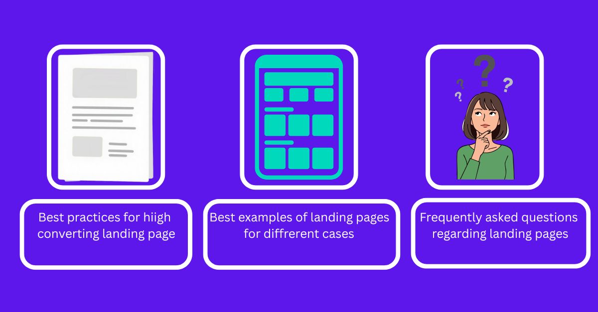
What Makes a Landing Page Truly Awesome?
An awesome landing page does three things exceptionally well:
- It grabs attention immediately
- It builds trust fast
- It makes taking action feel natural and safe
No fluff. No distractions. No confusion.
When someone lands on your page, they should instantly think:
“This is exactly for me.”
Speak to One Person, Not Everyone
The biggest mistake I see? Trying to impress everyone.
Your landing page should feel like it’s written for one specific person with one specific problem.
Instead of:
“We help businesses grow online”
Say something like:
“We help small business owners get consistent leads without wasting money on ads.”
The more specific you are, the more powerful your message becomes.
Your Headline Should Stop the Scroll
Your headline is not a slogan. It’s a promise.
A strong headline clearly answers:
- What do I get?
- Why should I care?
- Is this for me?
Examples that work:
- Create a Landing Page That Turns Visitors Into Customers
- Get More Leads From the Same Traffic—Without Redesigning Your Website
- Build a High‑Converting Landing Page Even If You’re Not a Designer
If your headline doesn’t make people want to read the next line, nothing else matters.
Make the Visitor Feel Understood
People don’t convert when they feel sold to. They convert when they feel understood.
Talk about their struggles:
- Wasting money on ads
- Getting traffic but no leads
- Confusing website layouts
- Low trust from visitors
When you describe their problem better than they can, trust is created automatically.
Show the Outcome, Not the Process
Most people don’t care how you do it. They care about what changes for them.
Instead of listing features, paint a picture:
- Waking up to new leads
- Booking calls on autopilot
- Turning visitors into customers
- Finally feeling confident about your website
This emotional clarity is what drives conversions.
Keep the Design Clean and Calm
A great landing page feels calm, not chaotic.
Simple design builds confidence.
What works best:
- Plenty of white space
- One clear call‑to‑action
- Easy‑to‑read fonts
- Real images or clean visuals
- A layout that works perfectly on mobile
If something doesn’t help the user decide, remove it.
Your Call‑to‑Action Should Feel Easy
The best CTAs don’t feel like pressure.
They feel like the obvious next step.
Examples:
- Get My Free Audit
- Book a Free Call
- See How It Works
- Start Free—No Credit Card Required
Avoid making people think too much. Clarity beats creativity every time.
Trust Is the Real Conversion Hack
If someone doesn’t trust you, they won’t convert—no matter how good your copy is.
Ways to build trust naturally:
- Testimonials from real people
- Clear explanation of what happens next
- Honest FAQs
- Simple language (no buzzwords)
- Showing your face or brand story
Trust reduces friction more than any design trick.
SEO Without Killing the Human Feel
Yes, your landing page should rank on Google—but never at the cost of readability.
Use keywords naturally:
- In the page title
- In headings
- In the URL
- In image alt text
But write for humans first. Google follows.
High‑intent keywords that work well:
- how to create a landing page
- high converting landing page
- landing page optimization
- landing page design that converts
An Awesome Landing Page Is Never Perfect—Just Better Over Time
The best landing pages evolve.
They improve based on:
- Real visitor behavior
- Real questions people ask
- Real objections you hear on calls
Start simple. Publish fast. Improve continuously.
That’s how great landing pages are actually built.
5 Examples of High‑Converting Landing Pages (With Why They Work)
Sometimes the fastest way to understand what works is to look at real examples.
Below are five types of landing pages that consistently convert well, along with the reason behind their success. You don’t need to copy them word for word—borrow the thinking.
1. SaaS Free Trial Landing Page
Example use case: Project management tools, CRM software, AI tools
Why it converts:
- Clear promise in the headline
- One simple CTA: Start Free Trial
- Shows product screenshots immediately
- Removes risk (no credit card required)
Key takeaway: Reduce friction as much as possible when asking users to try something new.
2. Service‑Based Booking Landing Page
Example use case: Marketing agencies, consultants, freelancers
Why it converts:
- Speaks directly to a painful problem
- Positions the service as the solution
- Uses testimonials to build trust
- CTA focuses on a free call, not a sale
Key takeaway: People are more likely to talk first than buy immediately.
3. Lead Magnet Landing Page
Example use case: Ebooks, checklists, free audits, templates
Why it converts:
- Clear value exchange (email for value)
- Focused on one outcome
- Simple form with minimal fields
- Strong benefit‑driven copy
Key takeaway: Make the free resource feel genuinely useful, not generic.
4. Webinar or Workshop Registration Page
Example use case: Coaches, educators, SaaS demos
Why it converts:
- Time‑bound urgency
- Clear learning outcomes
- Authority positioning of the host
- Reassurance about who it’s for
Key takeaway: People sign up when they know exactly what they’ll learn.
5. Product‑Focused Sales Landing Page
Example use case: Digital products, tools, subscriptions
Why it converts:
- Focuses on transformation, not features
- Uses social proof heavily
- Handles objections before they arise
- Clear, confident CTA
Key takeaway: Show the outcome clearly and remove doubts early.
Frequently Asked Questions About Landing Pages
Do I really need a landing page if I already have a website?
Yes. A website explains everything you do. A landing page focuses on one action, which is why it converts better.
How long should a high‑converting landing page be?
As long as it needs to be. Some audiences convert with short pages, others need more explanation. Clarity matters more than length.
Can landing pages rank on Google?
Absolutely. When optimized for search intent, page speed, and relevance, landing pages can rank extremely well for high‑intent keywords.
Should I use multiple CTAs on one landing page?
Ideally, no. One primary CTA keeps the visitor focused and reduces decision fatigue.
What’s the biggest mistake people make with landing pages?
Trying to sound impressive instead of being clear. Simplicity almost always converts better.
Things to know before you go
If you’re feeling stuck or overwhelmed while creating a landing page, you’re not alone.
Most people don’t struggle because they lack tools or templates. They struggle because they’re trying to sound perfect instead of being real.
Here’s a simple mindset shift that helps:
Don’t think of your landing page as a page.
Think of it as a conversation.
You’re talking to one person who has a problem, a doubt, and a hope that things can be better. Your job isn’t to impress them—it’s to guide them.
If your landing page makes someone feel understood, safe, and clear about the next step, you’ve already won.
Everything else—design tweaks, copy experiments, SEO improvements—can come later.
Build something honest. Put it out there. Improve it as you learn.
That’s how landing pages that actually convert are made.
Explore More SEO & Growth Guides
If you’re serious about getting more traffic and conversions, these articles will help you go deeper:
- How to Rank Higher on Google Fast (Without Paid Ads) – A practical guide to improving rankings with smart SEO fundamentals.
- Free Traffic Sources That Actually Work in 2026 – Real ways to bring consistent traffic without spending money.